A note on Responsive design
Categories:
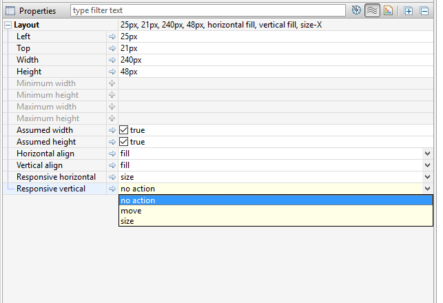
Finding the best UI experience on mobile and desktop, in both portrait and landscape and across all mobile devices is an art. All Layout Managers offer ways to achieved responsive design. The iiziGo design workbench offers Responsive horizontal and Responsive vertical properties of components when placed in the Absolute Layout. This feature allows a component to be assigned a different size or position when the device orientation is changed.

With a Border Layout, you must assign components a region property of value: top, center, bottom or left and right. These regions resize in relation to one another when device orientation is changed. Responsive design for mobile devices can also be achieved by working with IIZI selectors. Selectors can be set on the Phone and Tablet packages in your easy project, as well as for portrait and landscape for any given Panel, by creating and assigning selectors to portrait and landscape packages. For a full description of how to use selectors, see section Selectors of this chapter.
Feedback
Was this page helpful?
Glad to hear it! Please tell us how we can improve.
Sorry to hear that. Please tell us how we can improve.