Properties
Categories:
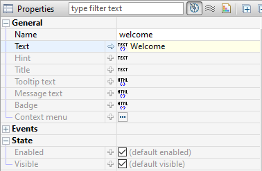
The properties of the selected component are shown – and are editable – in the Property Editor. If the Property Editor is not visible, select a Panel, a container, or any component, and the Property Editor will appear below the Panel’s tree view. For a complete guide to using the Property Editor see section Editors, Tools and Tabs.
The properties that appear in the Property Editor are context sensitive and depend entirely on the selected component or selected container. A property consists of a name on the left and a corresponding value to the right. Hovering over the property name displays a tooltip description of the property. Experienced web developers will find many familiar HTML5 and CSS3 attributes as name-value pairs.
Container and component properties
Always keep in mind that the properties displayed for you in the Property Editor correspond to the container or component that is selected. With nothing selected – or with focus outside of the Panel Editor – your Property Editor will be empty. With several components selected, the editor will exclude unshared properties.
An undefined property may not have a value at all, and will not exist in the mark-up that defines your component. This is like excluding an attribute or property when writing HTML and CSS; it simply will not exist in the mark-up. Some properties are required and therefore require values, and are assigned a default value. To see the default values, mouse over the property for the tooltip or click the arrow at the start of the value field to reveal its default value in the value field.


The name, actions, events and states of a component will always be found in the Base properties. The width, height and position will be in the Layout properties and most all the remaining properties we associate with CSS will be found in the Styles properties.
General properties
Although property sets are different depending on the component selected, the following properties exist for all components: Name, Title, Tooltip text, and the boolean states: Enabled and Visible.

Feedback
Was this page helpful?
Glad to hear it! Please tell us how we can improve.
Sorry to hear that. Please tell us how we can improve.