Layout
Categories:
You apply a Layout Manager to a Panel or other container to control the position of its child components. The available layouts are Absolute, Border, Flex and Grid. When creating a Panel or container you are given the choice of Layout Manager in the New Panel wizard or New Container wizard. You can also select the container and click the Layout tool in the Panel Editor toolbar. Some containers have an explicit Layout Manager already assigned and in these cases the Layout tool is disabled.
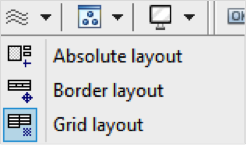
Absolute layout
Absolute Layout will position and size children according to absolute values relative to the container. Minimal and maximum sizes and component alignment can be defined. Position and size properties are available under Layout properties for both the container and for individual components in the Property Editor. Click to view or double click the Layout button in the Property Editor tool bar to isolate the Layout properties. Components in the Absolute Layout have the following Layout properties:
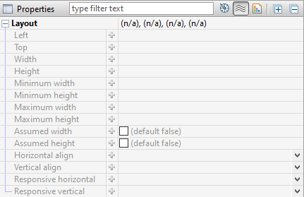
To achieve a responsive design with Absolute Layout, percentages can be used in Left, Top, Width, and Height values. The Property Editor also accepts percentages in combination with pixel values. For example, a component can be given a Top value of 50% minus one half of its width, to keep it in the vertical center of its parent container regardless of the containers size and shape.
Border layout
The Border layout will always stretch to fill its parent container; the Border layout will position components in the five defined regions of Top, Bottom, Center, Right and Left (Leading and Trailing are also defined for RTL language design). Visual hints are provided when dropping a component into a container with Border layout. Multiple components can be placed in the same region.
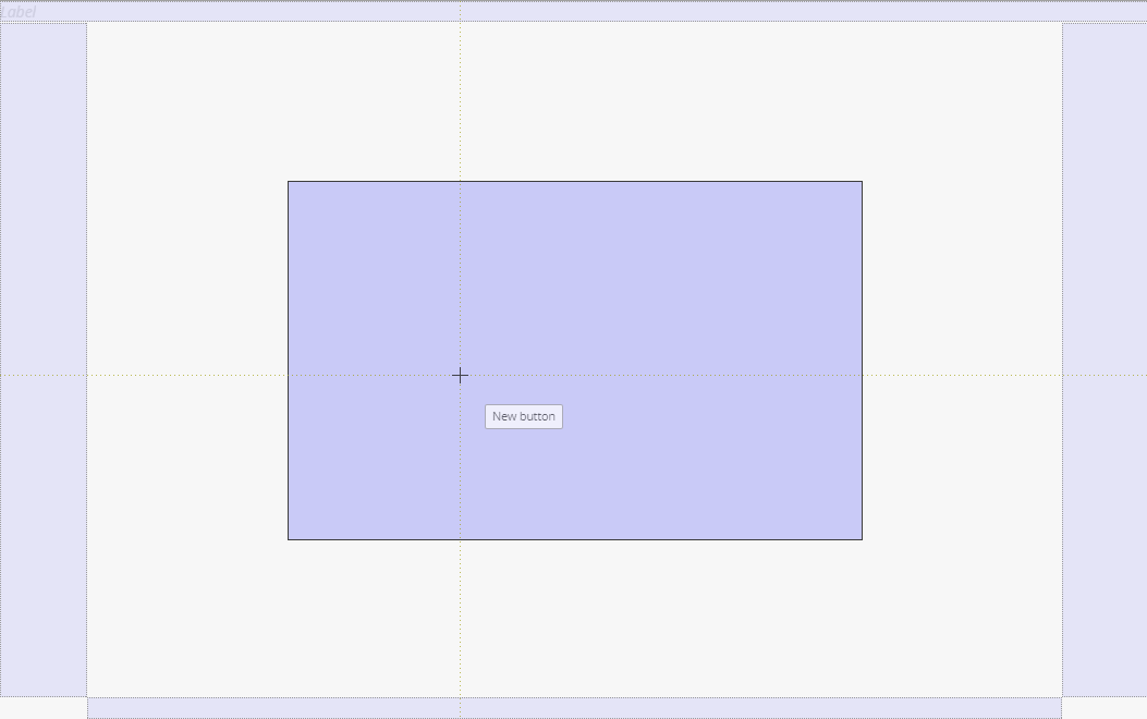
Click or double click the Layout button in the Property Editor tool bar. Components in the Border Layout have the following layout properties:
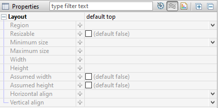
The regions can be resizable at runtime by setting the Resizable property. The following values are only meaningful when the Resizable option is used: Define the limits for how small and how big with Minimum size and Maximum size as well as the initial size Width and Height.
The properties defining how the container should behave are the following:

The top and bottom regions extend the entire width of the container and the remaining regions are placed in the middle. With the left and right (or leading and trailing) regions, the side regions take priority, extending the full height of the container. If the Gutters property is defined, the regions will have spacing between. The Live resize property will allow the regions to be resized at runtime.
Grid layout
The Grid Layout arranges components in rows and columns. The properties defining the Grid Layout are the following:
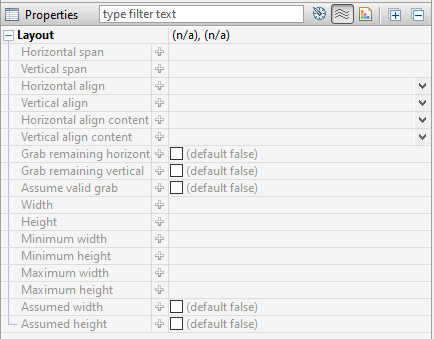
The number of columns is defined and the number of rows is then calculated as depending on the number of components added. The Same width and Same height properties specify whether the columns and / or rows should be distributed evenly in the Grid. The Cell spacing and Cell padding can be defined and will then be applied for all cells in the Grid.
The potential overflow of the Grid container’s content is determined by the Horizontal and Vertical align properties.

When dragging a component over a Grid layout container, the container displays visual hints for positioning the component. Depending on the settings mentioned above, the Grid will adapt to the new components, potentially adding rows and columns.
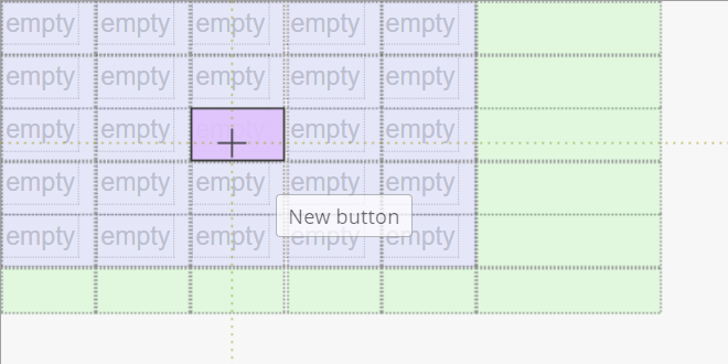
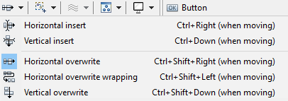
Another way to design the structure of the Grid is to use the Grid layout actions tool in the toolbar. If the container is not empty, the way in which the newly introduced components should relate to earlier components can be specified in the Distribute dropped components menu in the toolbar.
Grid Demo
There is a short demo of what you can do with Grid Layout:
You need a QuickStart project:
- Select
File > New > IIZI Module Project (Quickstart) - Enter
project nameand unselectCreate text tables with automatic translation - Press
Finish
- Select
Create a
Grid Layout panelor Add agrid layout containerto your panel.You can add
some componentsin this container.
For the example we show you all actions you can do:
Grid layoutactions:Clear- Insert
rowbefore and after - Insert
columnbefore and after - Delete
row and column - Extend
overwrite horizontally and vertically - Extend
insert horizontal and vertically
Distributedropped controls:Horizontal and vertical insertHorizontal and vertical overwriteHorizontal overwrite wrapping
Generalproperties for grid:Column countHorizontal and vertical cell spacing
Componentsproperties:Horizontal and vertical spanHorizontal and vertical align content
Flex layout
To Do
Feedback
Was this page helpful?
Glad to hear it! Please tell us how we can improve.
Sorry to hear that. Please tell us how we can improve.